
September 18, 2003
Pop Growth
This is a pretty interesting graph:
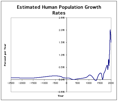
The original source is from a paper by Michael Kremer in the Quarterly Journal of Economics called Population Growth and Technological Change: One Million B.C. to 1990.
If I had the time, I'd read more about the methodology, but as it is, it makes you wonder about every little blip — wars, plagues, famines....
Plus, the sharp drop off at around 1975 or so.
Brad DeLong comments about the sweet spot in income levels for population growth — too low and people die off, too high and people choose not to reproduce as much. He's got another graph that shows a modern-day spread of population growth vs. per capita GDP showing the highest growth between $1,000 and $3,000.
Posted by richard at September 18, 2003 03:00 PMComments


