
March 15, 2004
More Employment
First, Brad DeLong offers a more balanced view of the unemployment situation from Dana Milbank.
But for those of you who enjoyed all of the employment talk below, here's another graph from the BLS that goes to the heart of the matter:
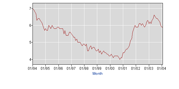
This graph shows the number of unemployed and discouraged workers as a percentage of the labor force plus the discouraged workers. Discouraged workers are those who are no longer in the labor force because they were discouraged that they could not find a job. So this rate gives us a better indication of how many people would like to work, but can't (or couldn't) find a job.
Unfortunately, this data doesn't exist before 1994, so we can't get a more historical perspective on it. But it clearly shows that despite being significantly higher than the late nineties, this metric has moved significantly (in the right direction) since June 2003. The National Review would have done well to refer to this metric as well as the standard unemployment rate numbers.
While we're at it, here's another bit of under-reported good news. Average hourly wages of production, non-supervisory jobs (in constant 1982 dollars):
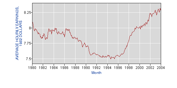
This should be the productivity gains kicking in, leading to higher average real wages even than during the bubble.
So I'm sticking to my not-all-doom-and-gloom position for now.
Posted by richard at March 15, 2004 11:20 PM


