
February 06, 2006
Red, Blue, Rich, Poor
Kevin Drum notes an interesting paper (PDF) on Republican voting in poor states vs. in rich states. The author of the paper has a blog where he discusses the results. The argument is that in rich states (like Connecticut, the richest) poor voters vote Republican in almost the same amount as rich voters do (i.e. the slope of percentage voting Republican as a function of income is pretty flat). On the other hand, poor states (like Mississippi, the poorest) poor voters vote Republican much less than rich voters do (i.e. the slope is fairly positive). In fact, they show that this result works across states with the slopes being negatively correlated with state-wide income. Here's the finding in a pretty clear (once you ponder it for a sec) graph: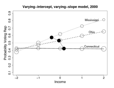 I actually think the graph is excellent – it packs a lot of information into a small space. The y axis is the percentage voting Republican in the 2000 election, the x axis is a quantile-based scale of individual income, the open circles denote the number of voters in each quantile for each state and the black circles show the mean income for the state.
So I'm with them so far, but then I thought... wait a second, what exactly is the "quantile-based scale" for income? A first glance, it's likely that it's a national scale because there explicitly are different quanitities shown in each quantile for each state – that wouldn't make a lot of sense if they were state-specific quantiles. Looking at the paper, I see this footnote on page 6:
I actually think the graph is excellent – it packs a lot of information into a small space. The y axis is the percentage voting Republican in the 2000 election, the x axis is a quantile-based scale of individual income, the open circles denote the number of voters in each quantile for each state and the black circles show the mean income for the state.
So I'm with them so far, but then I thought... wait a second, what exactly is the "quantile-based scale" for income? A first glance, it's likely that it's a national scale because there explicitly are different quanitities shown in each quantile for each state – that wouldn't make a lot of sense if they were state-specific quantiles. Looking at the paper, I see this footnote on page 6:
The National Election Study uses 1 = 016 percentile, 2 = 1733 percentile, 3 = 3467 percentile, 4 = 6895 percentile, 5 = 96100 percentile. We label these as −2, −1, 0, 1, 2, centering at zero so that we can more easily interpret the intercept terms of regressions that include income as a predictor.The assumption has to be that those are national income percentiles. And it's worth noting that they are most definitely not quintiles – they are very uneven. The paper's 0 and 1 include 61% of the electorate while 2 only includes the top 5%. Why these specific breaks are used is not stated, but it would be interesting to see how the results would change if different breaks where used. It also makes it difficult to visually interpret the size of the circles on the graph. But back to my main point: these are national quantiles. The problem with this is that I would posit that any "income-effect" on political persuasion would have a lot more to do with relative income within your peer group, and to the extent that it is absolute, would be modulated by cost-of-living adjustments. Looking at the chart again, and knowing that it's the poorest state, it seems clear that the people in income level 2 in Mississippi must be much less than 5% of the state electorate, while those in income level 2 in Connecticut must be more than 5%. For the sake of argument, let's say that income level 2 in Mississippi is 2% of the electorate, while in Connecticut it's 8%. I would expect the top 2% of a state's electorate to be pretty different from the top 8%, even if the absolute ranges were the same, simply because their relative "status" on the income scale is significantly higher. And that's before we take into consideration that after cost-of-living adjustment, the 2% of Mississippians in that top national ventile would feel much more rich than the 8% of Connecticutters in it. Likewise the bottom quantile must be much bigger than 16% in Mississippi and much smaller than 16% in Connecticut. Similar relative income and COLA effects would occur as on the top side. So here's an alternative hypothesis for the results they're getting: in each income quantile the Mississippians feel richer than the Connecticutters in the same quantile and therefore they vote Republican. This can be seen as a slight twist on the economic determinism argument, with subjective, relative income replacing objective, absolute income as the determinant. So would correcting for this make the effect they found go away? Probably not... or at least it's not clear that it would. But it would be interesting to see how the model held up on state-specific quantiles and/or COL adjusted ones. Would the top 2% of Connecticutters be more Republican than the top 8%, thus pushing the slope positive and diminishing the overall effect? I look to my statistical friends to catch any errors I've made in my logic. Posted by richard at February 6, 2006 10:58 PM
Comments


